

How label design reveals Alentejo authenticity
A wine bottle label is much more than paper and ink. It's the first handshake between the producer and the person holding the bottle for the first time. And this moment is worth more than many imagine: a good design can double sales, according to recent neuroscientific research. In Alentejo, where the land tells stories and the vineyards whisper memories of generations, label design has become a language of its own. In this article, we will explore how this visual language was born, grew, and became a faithful mirror of the Alentejo soul.
Index
- The Evolution of Wine Label Design in Portugal
- Regional Identity in Design: Symbols and Narratives of Alentejo
- The Impact of Design on Consumer Behavior and Choices
- The Role of International Distinctions and Awards
- Sensory Design: How the Label Communicates Beyond Sight
- Discover More About Wine and Design with Xico Sabido
- Frequently Asked Questions
Key Takeaways
| Point | Details |
|---|---|
| Design doubles sales | An appealing label design can double wine sales due to its visual impact. |
| Identity conveyed on the label | Symbols and cultural references on the label express the authenticity and history of Alentejo. |
| Awards value authenticity | International distinctions recognize wines whose visual image is faithful to regional roots. |
| Experience goes beyond sight | The texture and sensory composition of the label influence the perception of the wine during tasting. |
The Evolution of Wine Label Design in Portugal
For decades, Portuguese wine labels merely identified the producer and region. They were functional, sober, almost invisible. But from the 90s onwards, something changed. Producers began to realize that the bottle was also a canvas, and that this canvas could tell a story before the cork was removed.
The evolution of label design in Portugal has Esporão as one of its most recognized milestones. The Alentejo estate quickly invested in a strong visual identity, with illustrations that evoke the landscape and tradition, becoming a national and international reference. Other producers followed suit, realizing that the label was an integral part of the product.
In Alentejo, this transformation was especially felt. The region's rich culture, with its golden plains, Alentejo songs, and white and blue tiles, offered an inexhaustible source of visual inspiration. Understanding the origin of labels helps to understand how long and significant this journey has been.
The elements we recognize today in the best Alentejo labels did not appear by chance. They are the result of conscious choices:
- Serif fonts that evoke tradition and classic elegance
- Hand-drawn illustrations that evoke craftsmanship and connection to the land
- Warm color palettes inspired by clay, wheat, and the scorching Alentejo sun
- Historical references that anchor the wine in a specific time and place
“The label is the wine's business card. When well made, it doesn't need words to say where it comes from.”
Understanding the history of dry wine in Portugal also means understanding how design has accompanied the evolution of consumer preferences. And for those who want to learn more about wine quickly and accessibly, a quick wine guide can be an excellent starting point.
Regional Identity in Design: Symbols and Narratives of Alentejo
With the evolutionary context clear, it is essential to understand how regional identity gains visual prominence. Alentejo has a rich and unmistakable visual culture. And the best producers have managed to transform this richness into labels that speak directly to the heart of those who hold them.
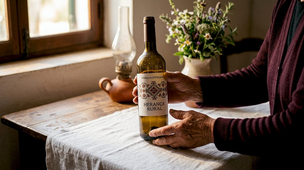
One of the most celebrated examples is that of Herdade Grande da Vidigueira, whose label inspired by an Alentejo scarf won an international design award. The scarf, with its colorful embroidery and geometric patterns, is a deep symbol of Alentejo identity. Seeing it on a label is recognizing the land before tasting the wine.
Other producers, such as Tapada de Coelheiros, integrate local history and innovation in a balanced way, creating labels that dialogue with the past without being trapped by it. It's a dance between tradition and modernity that results in truly memorable visual pieces.
| Approach | Visual elements | Example | Impact on consumer |
|---|---|---|---|
| Traditional | Embroidery, tiles, classic typography | Alentejo scarf | Emotional connection and nostalgia |
| Modern | Geometry, minimalism, vibrant colors | Abstract lines | Contemporary and international appeal |
| Hybrid | Mix of symbols and current design | Tapada de Coelheiros | Authenticity with global reach |
To identify authenticity in an Alentejo label, look for:
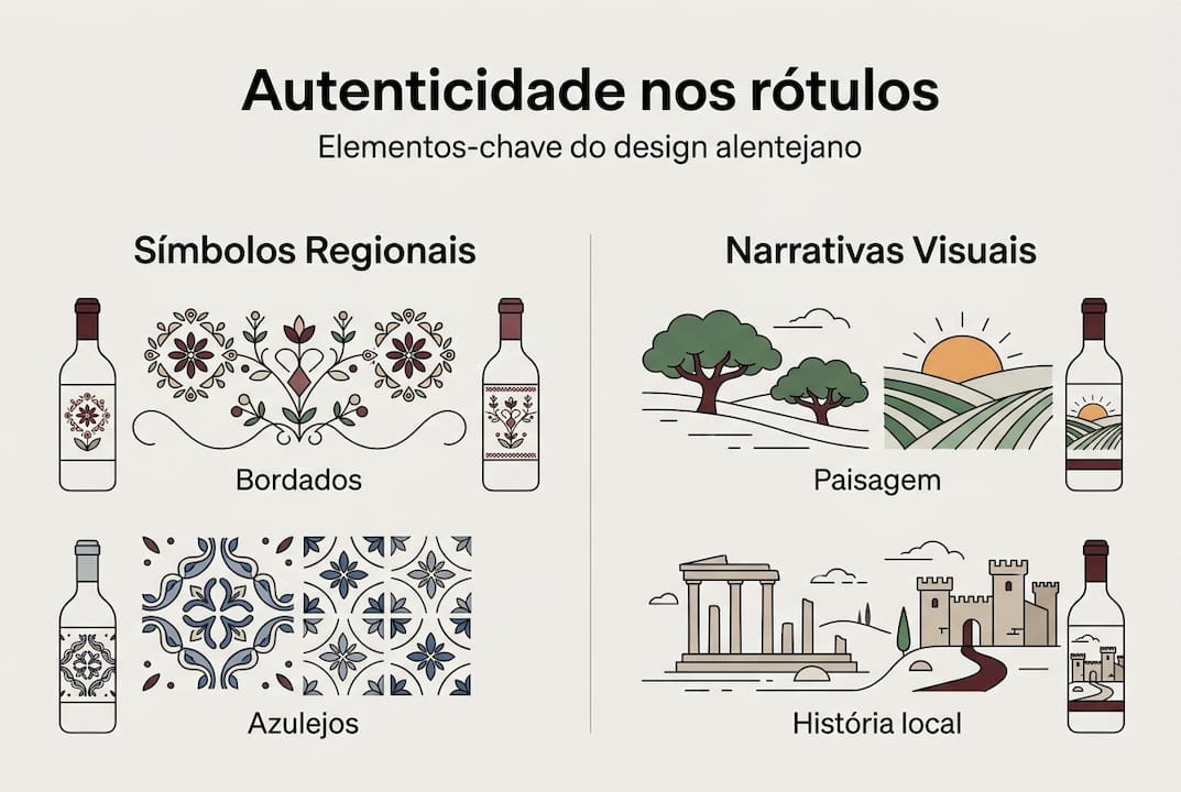
- Specific geographical references such as estates, hills, or local rivers
- Cultural symbols such as cante, Arraiolos rugs, or embroidered scarves
- Materials and finishes that refer to regional craftsmanship
- Back label narratives that tell the story of the producer and the vineyard
Professional Tip: Before buying, turn the bottle and read the back label. The most authentic producers tell the story of the vineyard, grape variety, and family there. If that story exists, it's a sign that the label is not just decoration.
Exploring the route of the best Alentejo wines is an excellent way to see these labels in context, understanding how each one reflects the Alentejo terroir in a unique way.
The Impact of Design on Consumer Behavior and Choices
After seeing the symbols used, it is important to explore the practical effect of these choices on the consumer public. Science has a lot to say about this. And what it says is surprising.
Neuromarketing studies show that pictorial elements capture more attention than text, potentially doubling wine sales. The human eye is attracted to images before reading any words. On a shelf full of bottles, the label has less than three seconds to capture attention.
Important data: Labels with a strong visual component can increase sales by up to 100% compared to text-only labels, according to neuromarketing research applied to the wine sector.
| Label type | Average attention time | Impact on sales |
|---|---|---|
| Text only | 1.2 seconds | Base reference |
| Image + text | 2.8 seconds | Up to +60% |
| Strong pictorial design | 3.5 seconds | Up to +100% |
The emotional decision-making process in wine purchasing generally follows these steps:
- Visual attention captured by the label in less than three seconds
- Emotional recognition of familiar or aspirational symbols
- Selective reading of name, region, and year
- Purchase decision influenced by the trust conveyed by the design
- Social sharing of the bottle, often motivated by the label's aesthetics
The importance of packaging design goes far beyond aesthetics. It communicates origin, quality, and authenticity instantly. To deepen the vocabulary around these choices, exploring the crucial wine terms helps to make the experience more conscious and enriching. And understanding how brands engage their customers reveals how design is just the beginning of a deeper relationship.
The Role of International Distinctions and Awards
Once we understand the weight of design in choices, the next step is to analyze how the world recognizes this visual authenticity. International design awards are not just trophies. They are public validations that a label has managed to communicate something true and universal.
The case of Herdade Grande da Vidigueira is exemplary. Its award-winning label showed the world that Alentejo's cultural heritage has aesthetic value recognized in highly competitive markets. Distinctions like the German Design Award evaluate rigorous criteria that go far beyond superficial beauty.
“An award-winning label is not just beautiful. It is honest. It tells a true story with extraordinary visual means.”
The most common criteria in evaluating award-winning labels include:
- Originality and ability to stand out in a saturated market
- Coherence between the design and the producer's identity
- Creative use of cultural and heritage elements
- Technical quality of printing and finishes
- Sustainability of the materials used
Professional Tip: At the point of sale, look for gold seals or mentions of awards on the label or packaging. They don't guarantee that the wine is the best in the world, but they indicate that someone, somewhere, recognized the effort to tell a story with visual integrity.
Knowing the designations of origin is another way to understand how authenticity is protected and certified. And to discover the best Alentejo wines, the route available on Xico Sabido is a valuable guide.
Sensory Design: How the Label Communicates Beyond Sight
When understanding awards, it's important to know how design can speak deeper to the senses than just the image. The label is not just something you see. It's something you touch, you feel, that prepares the body and mind for what's inside the bottle.
Multisensory experiences with labels show that design influences the perception of wine flavor and quality. A textured label, with embossing or spot varnish, creates a tactile anticipation that enriches the entire tasting experience. It's as if the bottle says, before being opened: pay attention, this is going to be special.
The most commonly used sensory elements in quality wine labels include:
- Dry or wet embossing that creates texture to the touch
- Spot varnish that highlights specific design elements
- Handmade or recycled paper that communicates sustainability and authenticity
- Laser engraving for fine and sophisticated details
- Gold or silver foil that evokes tradition and prestige
The relationship between sensory design and the tasting experience is profound. When we hold a bottle with a textured, well-constructed label, our expectation of the wine increases. And that expectation, in itself, influences how we taste. To deepen this connection, exploring the intensity and sensory experience of wine is a revealing exercise.
Professional Tip: Next time you hold a bottle of Alentejo wine, close your eyes and run your fingers over the label. If you feel texture, embossing, or surface variations, you are looking at a producer who has invested in the complete experience. This says a lot about the care they also put into the wine.
The science behind wine explains many of these phenomena in an accessible and fascinating way. And for those concerned about the environmental impact of choices, sustainable packaging is an increasingly relevant topic in the wine sector.
Discover More About Wine and Design with Xico Sabido
Label design is just the gateway to a much richer universe. At Xico Sabido, each bottle carries the soul of Alentejo, from the vineyard to the paper that wraps it. If this article has piqued your curiosity, there is much more to explore.

Learn the history of the Alicante Bouschet grape, one of Alentejo's red gems, and understand how its identity is reflected in the labels that celebrate it. Follow the Alentejo wine route and discover producers who transform tradition into visual art. And when you're ready to take a piece of Alentejo home, you can buy Alentejo wine directly, with all the authenticity you deserve. Xico Sabido's Compinchas already know: the pleasure begins before opening the bottle.
Frequently Asked Questions
Why do Alentejo wine labels stand out internationally?
Alentejo labels are recognized for their creativity combined with tradition, blending authentic cultural symbols with quality design. The award-winning label inspired by the Alentejo scarf is a perfect example of this visual and cultural strength.
Does label design influence the perceived taste of wine?
Yes, multisensory experiences with labels show that design affects the perception of taste and quality, preparing the senses even before the bottle is opened.
What elements should I look for on a label to identify Alentejo authenticity?
Look for regional symbols such as embroidery, tiles, or local geographical references, as traditional and innovative elements are the most reliable markers of genuine authenticity.
Traditional or modern labels: which sells more easily?
Both can be effective, provided they tell a coherent visual story. Pictorial elements capture more attention than text, regardless of the style chosen by the producer.
Recommendation
- Alentejo Terroir: Wines, Culture and Tradition - Xico Sabido
- Alicante Bouschet: The Alentejo's Red Jewel - Xico Sabido
- Alentejo Wine Route: The 10 Best Places - Xico Sabido
- Alentejo Grape Varieties with Xico Sabido - Xico Sabido
- Herdade dos Grous Tinto Vinho Regional Alentejano 0.75l (2023) - Lando’s